Kiva Mobile Onboarding
Onboarding users to empower social good
Timeline
June 2020 - August 2020
Tools
Figma
Disciplines
Interaction design
Content design
Process
Ethnographic research
Usability testing
Ideation workshop
User flow creation
Wireframing
Prototyping
Concept testing
MVP design
Hand-off
New users to Kiva didn’t understand the non-profit, nor did they feel incentivized to convert. This was hurting Kiva’s conversion rates.
So, I designed Kiva’s first ever onboarding flow, which increased conversion rates by 12%.
contextKiva is a non-profit organization that allows people to lend money to low-income entrepreneurs and students in 77 countries. Kiva's mission is "to expand financial access to help underserved communities thrive."
After working on a user research project ↗ for Kiva in spring 2020, I joined the Growth team in summer 2020 as the sole product designer on the team, owning the 0-to-1 design process focused on improving conversion rates.
On Kiva, there’s so many people to choose from.
Even more, there’s not a lot of personalization or education in the experience. Take a look:
Prior ethnographic research ↗ I conducted revealed that new users do not understand Kiva and do not feel incentivized to use the product. During my summer internship, I tackled this overarching business question:
How might we better educate and incentivize people to use Kiva?
discovery researchHow exactly we got here — starting with research
The semester before my internship, I worked on a user research ↗ project focused on new users. Here, we identified a specific pain points:
auto_awesome People want to support causes that resonate with their personal experiences and values
65% of people mentioned feeling motivated to give back to causes that personally relate to them.
sentiment_very_dissatisfied For many, it is very difficult to choose a loan because there are so many lending opportunities.
People find it a bit “demoralizing” to choose between borrowers on Kiva.
help The Kiva product does not communicate what Kiva is, how it works, and why it’s special.
It's not clear that Kiva is a microlending platform, nor how it exactly works.
ideationHypothesis: onboarding?
During my internship, I tackled various solutions to this problem. Among others (like a not-so-successful landing page redesign), user onboarding seemed like a promising solution. We’d be able to:
done Educate users about Kiva
done Allow users to support causes they care about
done Eliminate decision paralysis
done Improve conversion by +10% (forecast)
So, I began the design process, specifically for a mobile app MVP, as it was easy to target new users there.
Mapping entry points, decisions, and screens
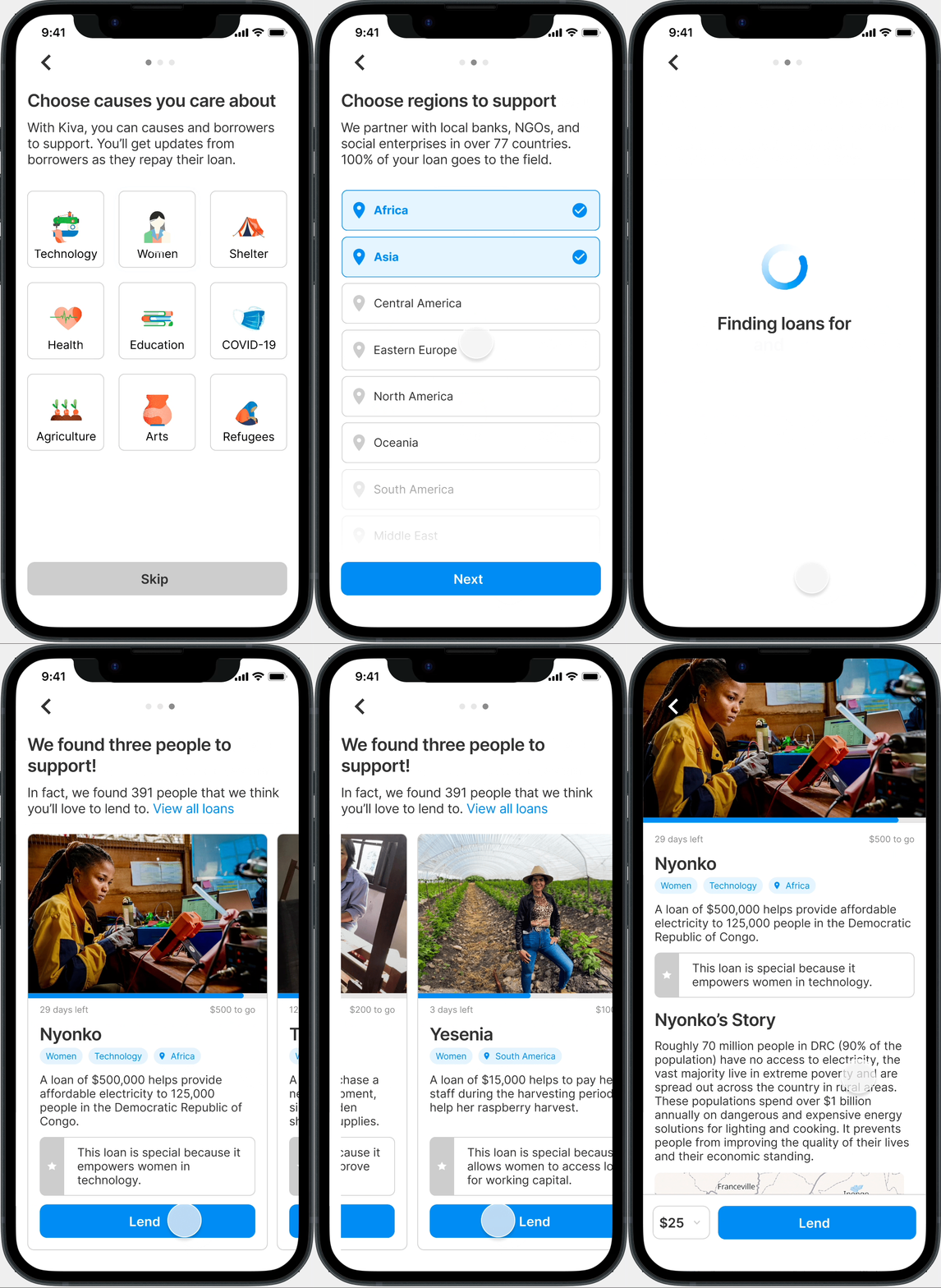
Users would go through a step-by-step flow that simultaneously collects their lending preferences and implicitly teaches them about Kiva along the way. After selecting their preferences, they’ll then see a curated list of loans with options to explore further.
design decision 01Along the way, I made some design decisions — first, about navigation.
We wanted users to fill out the flow, but we didn’t to force users to do anything. How could we allow users to progress to each step of the flow, while balancing agency and engagement?
design decision 02What is the visual treatment?
We heard from users that they want to learn how Kiva works. Is photography or iconography a better way to solve this need?
MVP DesignWith onboarding, no more decision paralysis
Users can learn about Kiva through the flow and the concept, and feel encouraged at the end to convert.
zoom_in Choosing Causes
Here, users choose up to nine causes they care about. The visual design is bright and poppy, which makes the experience feel more personalized and fun.
A large part of the design was content strategy. I worked with Kiva’s content strategist to craft easy-to-understand copy that would both educate users about Kiva and incentivize them. We kept the copy under two sentences and free of confusing language.
zoom_in Choosing Places
This point in the flow allows users to receive recommendations from a specific country.
Content strategy remained a focal point here as well. People typically have trouble grasping just exactly how Kiva works. The short copy here addresses the confusion behind the financial, bureaucratic aspect of Kiva.
Like the previous screen, this screen gives users the ability to connect with things that are important to them, while learning about Kiva through the copy and the interface.
zoom_in Loading Your Recommendations
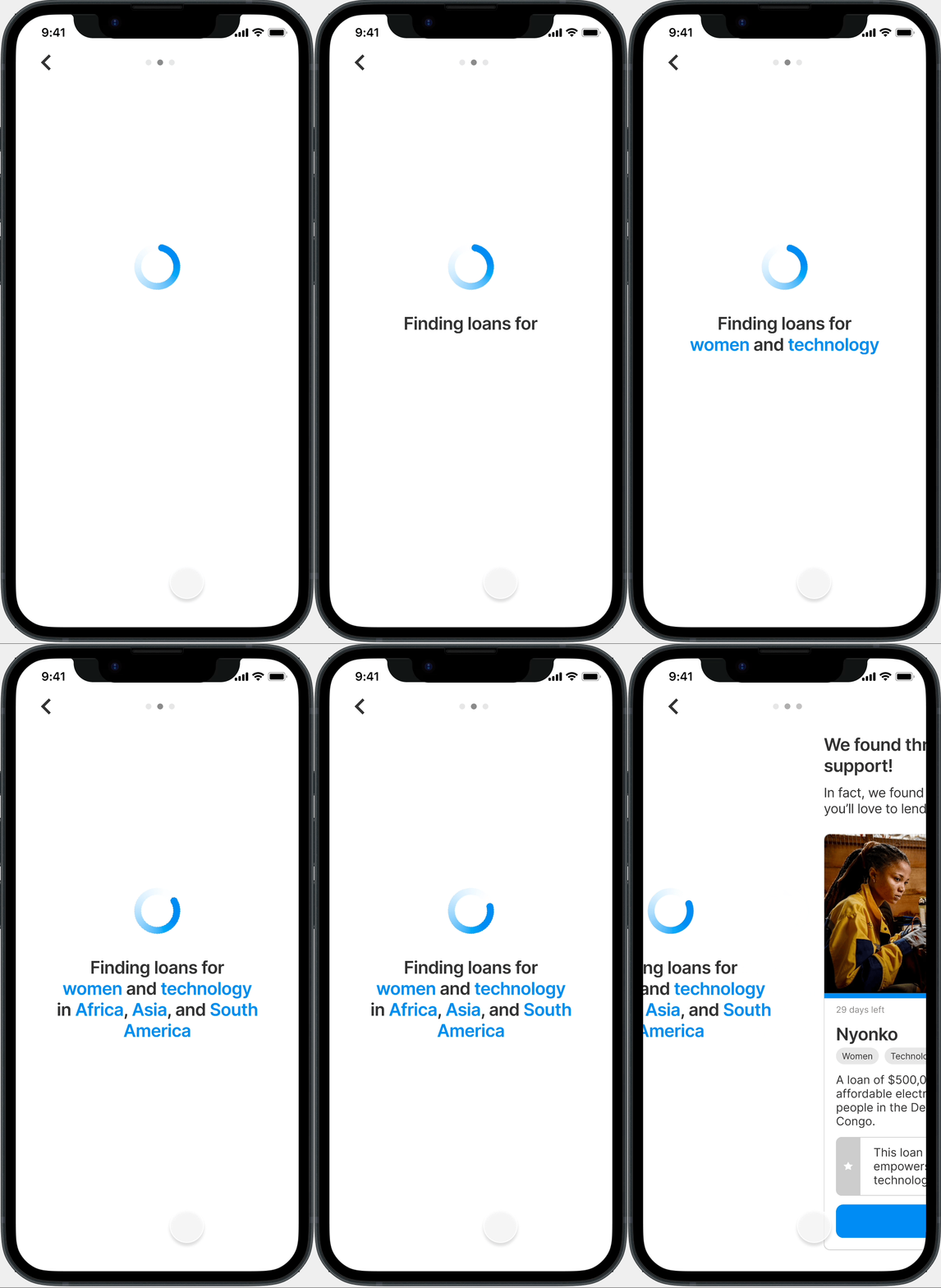
Here’s an animation of the loading screen before users are shown their loan suggestions. It’s a playful, immersive experience that incentivizes users to fund their recommended borrowers because the experience feels special and catered.
zoom_in Recommendations
Here, users receive recommended entrepreneurs to support.
I designed a new card layout that emphasizes why this loan is special to help personalize each borrower's story and engender a call to action. For an even more immersive experience, I experimented in an Instagram Story-like interaction.
The MVP increased add-to-basket by +12%.
Ultimately, my onboarding flow helps solve surrounding confusion and decision paralysis about Kiva by providing users with recommended loans. Business goals are also taken into account because of the upsell at the end of the flow.
Reflection
Being able to open a product from conception to shipping was highly rewarding. Not only was I the sole product designer, I was part of the research team that uncovered the user needs in the first place. Though the product was an experiment, I’m confident it’s a viable solution to the problem Kiva users face.
I’d do a few things differently if I could. First, I’d want to research the mental models of users during the flow. After all, we made assumptions about the steps in the user flow — do users actually think about the countries they support? Perhaps, users think more broadly, like in terms of continents. Secondly, I’d want to dig deeper into how users enter the flow to begin with, beyond the landing page.


